Taylor Swift album covers are much more than attractive images placed on the front of a record. Across her career, they have become an important part of how each musical era is introduced, understood, and remembered. From the soft country aesthetic of her early releases to the muted, introspective photography of her later work, Swift has repeatedly used visual design to create a distinct identity for every chapter of her career.
What makes Taylor Swift album covers especially interesting is how closely they connect with the music. The colors, clothing, photography, typography, facial expressions, locations, and even the amount of empty space can communicate something about the album before a listener hears a single song. For longtime fans, studying the covers has become almost like studying a visual timeline of Swift’s life and artistic development.
Her album artwork has also changed alongside the music industry. Physical albums, deluxe editions, vinyl variants, streaming platforms, merchandise, and social media have all influenced how artists present their work. Swift has embraced these changes while maintaining a recognizable personal style, making her album covers some of the most discussed pieces of modern pop music imagery.
Taylor Swift: The Beginning of a Visual Journey
Taylor Swift’s self-titled debut album introduced an artist who was still closely associated with country music. The cover features a youthful Swift against a simple background, with a soft and approachable visual style that matched the personality of the record. It feels uncomplicated, sincere, and very much connected to the image of a young songwriter beginning her career.
The simplicity of the artwork is important when looking back at it today. Swift had not yet developed the elaborate visual worlds that would later become a trademark of her albums. Instead, the cover presented her as a relatively new performer whose songwriting was the main attraction. There was a sense of authenticity that suited songs about teenage romance, heartbreak, friendship, and growing up.
The cover now carries an additional meaning because of what came afterward. Seeing the young artist on that first album makes the enormous scale of her later career feel even more remarkable. It represents the starting point of a journey that would eventually move through country, pop, indie folk, alternative sounds, and experimental songwriting.
Fearless and the Rise of a Recognizable Era
With Fearless, Swift’s visual identity became more polished. The album cover captures her in a warm, romantic setting, with her hair flowing and her face turned toward the viewer. The image feels youthful and dreamy, which fits an album filled with songs about first love, emotional vulnerability, and the excitement of young relationships.
The visual presentation of Fearless helped reinforce the idea that Swift was not simply a country singer. She was developing into a major songwriter with a strong personal brand. The cover was glamorous without appearing overly complicated, allowing the artist herself to remain the central focus.
The later Fearless (Taylor’s Version) artwork also demonstrated how powerful nostalgia could be. Rather than simply recreating the original cover, Swift presented an updated image that connected her present-day identity with the era of the original album. It became part of the larger story surrounding her re-recording project and the recovery of ownership over her earlier recordings.
Speak Now and the Power of Purple
Speak Now introduced one of the most visually recognizable colors in Swift’s discography: purple. The cover shows Swift in a flowing dress, captured in motion, creating an almost fairytale-like atmosphere. The image immediately communicates romance, drama, and storytelling.
Purple became strongly associated with the Speak Now era, and that association has remained powerful among fans. The color works particularly well with the album’s themes because the songs often feel theatrical and emotionally detailed. Tracks such as “Mine,” “Back to December,” and “Enchanted” have strong narrative qualities, and the cover reflects that storytelling approach.
The re-recorded Speak Now (Taylor’s Version) maintained the importance of purple while giving the visual concept a more mature appearance. The updated artwork demonstrated how Swift can revisit an old creative identity without simply copying it. The result feels connected to the original era while still belonging to the artist she has become.
Red and the Beginning of a Major Transformation
The Red album cover marked a noticeable shift. Swift appears wearing a dark red lip and a hat, with the image cropped closely around her face. The design is simple, but the color palette and styling immediately suggest something more mature and emotionally complicated.
The title Red became central to the album’s visual identity. Red can represent passion, anger, love, heartbreak, danger, and intensity, making it an effective symbol for a record that explores relationships from several emotional angles. The cover does not need elaborate scenery because the color itself carries much of the message.
Red (Taylor’s Version) continued that visual conversation while introducing a different image of Swift. The updated cover retained the connection to the original album but gave fans a new visual representation of the era. It also became part of the broader cultural moment surrounding the release of “All Too Well (10 Minute Version),” which helped bring renewed attention to the album.
1989 and the Polaroid-Inspired Aesthetic
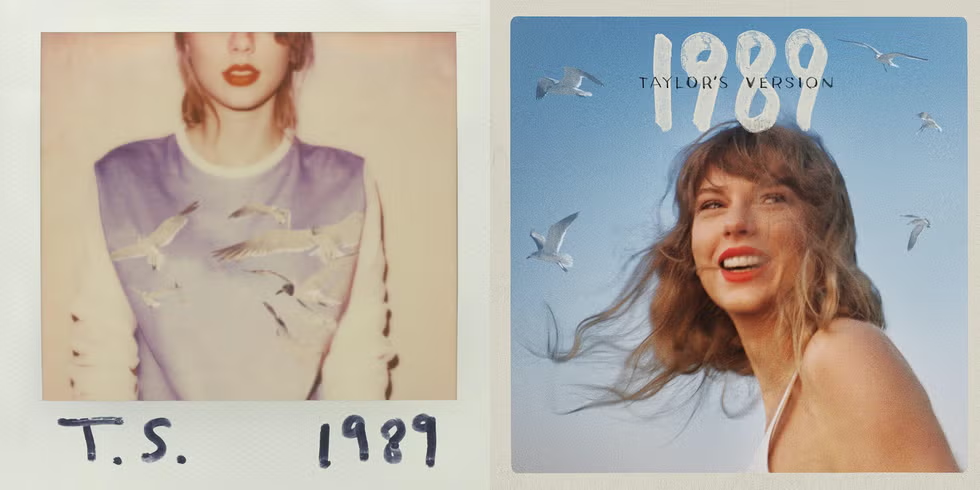
When 1989 arrived, Swift fully embraced pop music, and the album cover reflected that change. The famous photograph focuses on the lower portion of Swift’s face, with a polaroid-like presentation and muted styling. Her identity is recognizable without giving viewers a conventional portrait.
That decision was clever because 1989 was an album about reinvention. Swift was moving away from the country-pop identity that had defined much of her earlier career. The cover therefore feels deliberately different from the more traditional portraits used on previous records.
The re-recorded 1989 (Taylor’s Version) kept the recognizable visual language while presenting Swift in a new setting. The artwork continues to emphasize nostalgia, but it also communicates confidence. In retrospect, the original 1989 cover feels like a snapshot of a career-defining transition, while the newer version reflects an artist looking back at that period from a much stronger position.
Reputation and the Art of Reinvention
Few Taylor Swift album covers created as immediate a contrast with an earlier era as Reputation. The artwork is black, white, and intentionally provocative, featuring newspaper-style typography and repeated versions of Swift’s name. It feels sharper and more confrontational than almost anything she had released before.
The design made a statement before listeners even reached the first song. After years of intense public attention, Swift’s Reputation era deliberately played with celebrity culture, media narratives, and the idea of public image. The album cover’s newspaper motif was particularly effective because it referenced the constant attention surrounding her.
Rather than trying to look universally appealing, the artwork leaned into tension. That choice helped make Reputation feel like a complete visual era rather than simply another album release. The cover, stage designs, music videos, merchandise, and fashion all contributed to the same darker identity.
Lover and a Complete Change in Mood
After the darkness of Reputation, Lover arrived with a dramatically different visual personality. The album cover is filled with pastel colors, dreamy lighting, and a heart-shaped aesthetic. Swift appears in a soft, colorful environment that immediately suggests romance, optimism, and emotional openness.
The pastel palette was essential to the album’s identity. While Lover certainly contains heartbreak and uncertainty, its overall presentation is warmer and more playful. The artwork helped establish that difference before the songs were even heard.
The cover also became closely associated with Swift’s use of bright colors during the era. Pink, blue, lavender, and other soft tones appeared throughout promotional materials, performances, merchandise, and music videos. It demonstrated how effectively a single album cover can establish a broader visual language.
Folklore and the Beauty of Minimalism
Folklore represented another dramatic change. Instead of a brightly colored portrait, Swift appeared in a black-and-white image surrounded by trees. The photograph feels distant, quiet, and cinematic, immediately suggesting a more introspective musical experience.
The minimalism was particularly effective because it arrived during a period when many listeners were spending more time at home and looking for immersive forms of entertainment. Folklore did not need an extravagant cover. Its understated image invited curiosity and made the album feel almost like a mysterious book.
The artwork also matched the record’s songwriting style. Songs such as “Cardigan,” “The Last Great American Dynasty,” and “August” rely heavily on atmosphere and storytelling. The cover creates a similar feeling, as though the viewer has stumbled into a story taking place somewhere distant and slightly unreal.
Evermore and a More Intimate Perspective
Evermore continued the aesthetic direction established by Folklore, but its cover was noticeably different. Instead of showing Swift’s face, the image presents her from behind, standing in front of a wooded landscape while wearing a textured coat.
That perspective gives the cover a sense of distance and mystery. The listener is not being invited into a glamorous portrait; instead, Swift appears almost like a character within a larger landscape. This works naturally with the album’s reflective and narrative-driven songs.
The artwork also shows how Swift’s later albums became less dependent on conventional celebrity imagery. Her face does not always have to dominate the cover for the album to feel unmistakably hers. In some cases, the absence of a direct portrait actually creates more curiosity.
Midnights and the Return of the Close-Up
Midnights brought Swift back to a more recognizable portrait format, but the presentation was unlike her earlier covers. The image features a close-up of Swift with a blue-toned, grainy appearance, accompanied by a distinctive track-listing design.
The cover’s visual mood fits the album’s central concept: thoughts and emotions that become louder during the night. There is something intimate and slightly surreal about the photograph, making it feel like a private moment rather than a traditional promotional portrait.
The album also expanded the idea of what an album cover could become in the streaming and vinyl era. Different editions and variants gave fans multiple visual interpretations of the same musical project. This helped turn Midnights into not only an album but also a collectible visual experience.
The Tortured Poets Department and a More Literary Identity
The Tortured Poets Department continued Swift’s interest in subdued, editorial-style imagery. The primary artwork uses black-and-white photography and a serious, almost literary atmosphere. Compared with the vibrant colors of Lover or the dramatic presentation of Reputation, it feels restrained and introspective.
The visual identity works especially well with the album’s title. The phrase “The Tortured Poets Department” immediately suggests literature, emotional complexity, romantic melancholy, and artistic self-examination. The cover reinforces those associations rather than competing with them.
Swift’s use of monochrome photography also gives the album a timeless quality. It feels less tied to a specific pop trend and more like the cover of a personal collection of writing. That approach fits an album that spends considerable time examining relationships, memory, fame, longing, and the complicated process of turning private feelings into art.
Why Taylor Swift Album Covers Matter So Much
One reason Taylor Swift album covers remain so popular is that they function as visual bookmarks for different periods of her career. Fans can often identify an album simply from its color palette, typography, clothing, or photographic style. Each cover immediately brings back memories of a particular musical era.
There is also a strong relationship between the artwork and Swift’s songwriting. Her albums are often carefully constructed worlds rather than collections of unrelated singles. The cover becomes the first doorway into that world, preparing listeners for the emotions and themes they are about to encounter.
The re-recorded albums have made this even more interesting. Swift has been able to revisit earlier visual identities while presenting them from a contemporary perspective. That process has given fans a chance to compare past and present versions of the same era, turning album artwork into part of a larger story about ownership, memory, and artistic growth.
The Lasting Legacy of Taylor Swift’s Album Artwork
Looking across Taylor Swift album covers reveals an artist who has never been afraid to change her visual identity. From the youthful simplicity of her debut to the dreamlike colors of Lover, the darkness of Reputation, the woodland minimalism of Folklore, and the literary mood of The Tortured Poets Department, each era has its own personality.
The most impressive part is that these changes rarely feel random. The visual choices generally connect with the music, lyrics, public moment, and artistic direction of the corresponding album. That consistency has helped Swift build one of the strongest visual identities in contemporary popular music.
Ultimately, Taylor Swift album covers are memorable because they tell stories before the music begins. They capture transformation, nostalgia, confidence, heartbreak, reinvention, and reflection in a single image. For fans, they are collectibles and symbols of favorite eras. For students of pop culture, they are examples of how music, photography, branding, and storytelling can work together. And for Swift herself, they have become another way to turn each chapter of her career into something visually unforgettable.
Read more: indykaila